Table of contents#
Open Table of contents
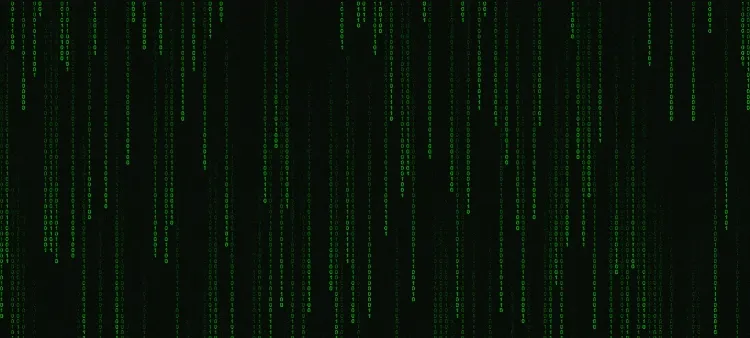
Step 1: HTML Structure#
First, we create the basic structure of the HTML page. It will contain a single element that will represent the “screen” where the characters will appear.
<!-- index.html -->
<!DOCTYPE html>
<html lang="en">
<head>
<meta charset="UTF-8">
<meta name="viewport" content="width=device-width, initial-scale=1.0">
<title>How to Create a Matrix Effect</title>
<link rel="stylesheet" href="style.css">
</head>
<body>
<canvas id="c"></canvas>
<script src="script.js"></script>
</body>
</html> Step 2: CSS Styles#
Now, let’s add the necessary styles to achieve the desired look, including the green color and the animation.
/* style.css */
* {
margin: 0;
padding: 0;
box-sizing: border-box;
}
body, canva {
width: 100vw;
height: 100vh;
overflow-x: hidden;
overflow-y: hidden;
}Step 3: JavaScript for the Effect#
Now, let’s add the JavaScript code to create the animation of characters falling down the screen. This code will generate the columns and the characters that move vertically.
/* script.js */
// Using Canva
var c = document.getElementById("c");
var ctx = c.getContext("2d");
// Making Canva full screen
c.height = window.innerHeight;
c.width = window.innerWidth;
var matrix = "10".split("");
var font_size = 10;
var columns = c.width/font_size; // Number of columns for the rain
// Array of binary raindrops, one per column
var drops = [];
for(var x = 0; x < columns; x++)
drops[x] = 1;
// Drawing the characters
function draw()
{
// Black background
ctx.fillStyle = "rgba(0, 0, 0, 0.04)";
ctx.fillRect(0, 0, c.width, c.height);
ctx.fillStyle = "#0F0"; // Green text
ctx.font = font_size + "px arial";
// Looping of raindrops
for(var i = 0; i < drops.length; i++)
{
var text = matrix[Math.floor(Math.random()*matrix.length)];
ctx.fillText(text, i*font_size, drops[i]*font_size);
if(drops[i]*font_size > c.height && Math.random() > 0.975)
drops[i] = 0;
drops[i]++;
}
}
setInterval(draw, 35);Explanation of the Code#
-
HTML: Defines a container where the effect will be displayed.
-
CSS: Styles the background of the page and the character columns, ensuring the effect visually matches the style of the Matrix movie.
-
JavaScript: Creates the logic for the animation. In each animation cycle, new characters are generated and fall vertically, creating the “rain” of characters effect.